วันนี้เรามาเรียนรู้กันเรื่อง Data Visualization บน Google Sheet กันดีกว่า เย้~
เรามาเริ่มจากตัวที่ง่ายที่สุดกันก่อนเลยดีกว่านะ
Sparkline
มี 2 แบบที่ใช้บ่อยๆคือ
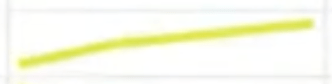
- แบบ Line
SPARKLINE(data, [options])

#ex
SPARKLINE(A1:F1)- แบบ BAR

SPARKLINE(A2:E2,{"charttype","bar";"max",40})มี Chartype อะไรบ้างล่ะ?
- “line” for a line graph (the default)
- “bar” for a stacked bar chart
- “column” for a column chart
- “winloss” for a special type of column chart that plots 2 possible outcomes: positive and negative (like a coin toss, heads or tails).
Option ใช้บ่อย
- Line chart
- “linewidth” determines how thick the line will be in the chart. A higher number means a thicker line.
- “color” sets the color of the line.
- Bar chart
- “max” sets the maximum value along the horizontal axis.
- “color1” sets the first color used for bars in the chart.
- “color2” sets the second color used for bars in the chart.
อันต่อไปมาลองอะไรร้อนๆกันดีกว่า
Heat map
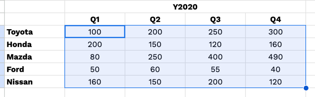
- mark data
2. conditional formatting

3.color scale
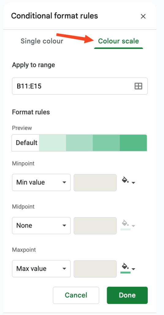
4.ใช้ mono chrome(สีเดียว) เพื่อความสะอาดและสบายตา

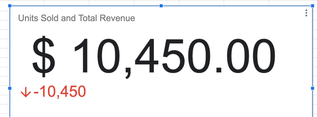
Score Card
เหมาะสำหรับการ show KPI
- icon insert chart

2. เลือก scorecard chart

3. เลือก key กับ baseline

4. สามารถใช้ aggreate ได้เลย
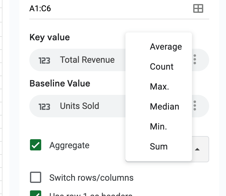
5. สามารถเลือกเป็น Range ได้

6. หน้าตาจะประมานนี้
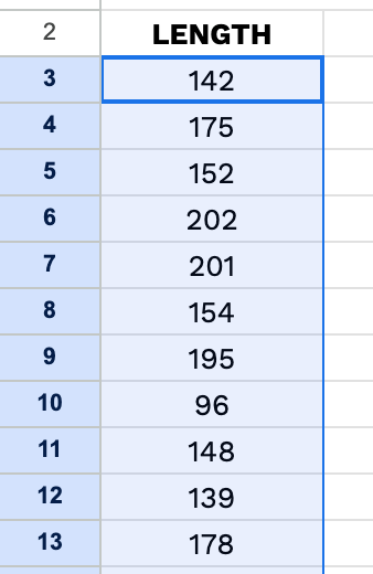
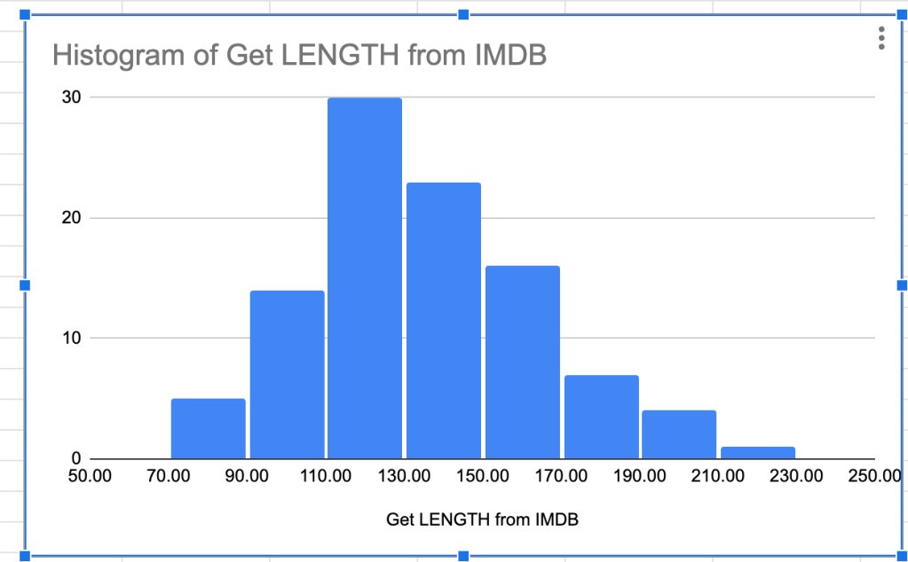
Histogram
ใช้กับตัวเลขเท่านั้น!
- query data
QUERY(data, query, [headers])
#ex
=QUERY(Dataset!A1:G101,"select E")
2. mark data
3. insert chart

4. เลือก histogram
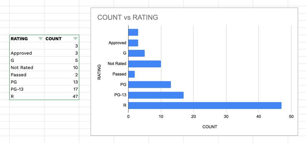
Bar
ทำจาก summary table

- Mark Data
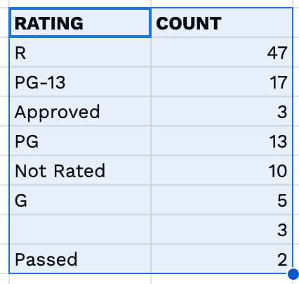
2. insert > chart > Bar chart
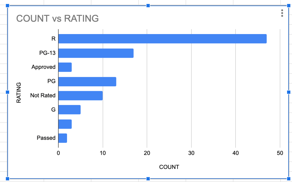
- สามารถ sort ได้
Line
- insert > chart > line chart

Scatter
- insert > chart > Scatter chart

- ทำ trend line ได้

Geo chart
โชว์กราฟบน world map
- insert > chart > geo chart

Tree map
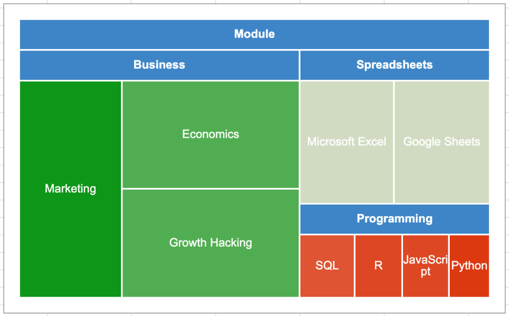
- ทำ data ตาม template นี้

2. insert > chart > Tree Map Chart